Monday, November 16, 2009

Matrix Text

1. Set #003100 (Dark green) as your foreground color. Now Use the text tool and type out what you want, I used Arial Black, 36pt.

2. Go to Filter > Blur > Gaussian blur and click ok for rasterizing the layer. Set radius to 1.

3. Now go to Filter > Distort > Ocean ripple and set these settings:
Ripple size: 5
Ripple Magnitude: 10


4. Duplicate the layer and go to Filter > Sketch > Water paper and set this settings:
Fiber length: 42
Brightness: 70
Contrast: 64

5. In the layers toolbar set the blend mode to Hardlight, or whatever you think looks better.
Merge the two layers (Ctrl+E).

6. Duplicate the layer and go to Filter > Blur > Motion Blur and use these settings:
Angle: 90
Distance: 33
Set the blend mode to Hardlight.

Blood Effect

1. Create new file with 72 PPI and white background. The mode has to be Grayscale. Type the text with thick font.

2. Select > Load Selection
(Choose Layer Transparency)

3. Layer > Flatten Image

4. Select > Inverse

5. Filter > Pixelate > Crystallize (cell size 4)

6. Select > Inverse

7. Noise > Add Noise
(Guassian, Monochromatic, Amount. 70)

8. Blur > Guassian blur (Radius 2.0)

9. Image > Adjust > Curve
(make the curve as shown in fig.)

10. Press Ctrl + D to deselect

11. Image > Adjust > Invert

12. Image > Rotate Canvas > 90 CW

13. Filter > Stylize > Wind

14. Method : Wind Direction : From the Right

15. Image > Rotate Canvas > 90 CCW

16. Image > Mode > RGB

17. Image > Adjust > Hue Saturation

18. Click Colorize

19. Drag the Saturation slider to 100

20. Drag the Lightness slider to -5

Saturday, November 7, 2009

How to Design Your Own Business Cards – Page 2 of 2

How to Design Your Own Business Cards – Page 2 of 2

This next layout is a unique business card design that you can do in Photoshop fairly easily. It also serves a dual purpose, should you venture into a combat zone. :)

Dog Tag – A Creative Business Card Idea for a "Slightly Unusual" Businessperson

To keep to the theme of the dog tag design, this isn't a photo business card like the other two. There's no good way to integrate a photo here.

If you take this design to a business card printer, they'll be able to do it in black and white, rather than colour. If you're on a budget, you can get cheap business cards if you design them with less colours, or no colours at all (as in this case).


1 – Creating a dog-tag shaped business card

Create a new layer.

Fill your background with 75% grey. (The code for this colour is BFBFBF if you need it.)

The following steps allow you to create large specks of noise.

Click Image > Image Size. Reduce the image to 25%.

Click Filter > Add Noise. Set the Amount to 20%.

Click Image > Image Size. Increase the image's size to 400%. Choose Nearest Neighbor from the drop-down box.

Click Filter > Blur > Motion Blur. Set the Distance to 60.

Create a new layer. Click on the Rounded Rectangle Tool, and set the Radius to 100px. Click the little Paths button at the top left of the screen. Draw a tag shape, as shown. Then press U, to change to the Ellipse Tool. While holding down Shift, draw in a little hole. Right-click the screen, and click Fill Path.

Ctrl+Click on this layer, in the Layers window, to select its outline. (You need to Ctrl+Click on the little thumbnail, not just anywhere on the layer.)

Click Select > Inverse.

Click the eye next to this layer, to hide it.

Click the layer underneath (should be the layer with the metal texture), and press delete.

Use the Type Tool to type in some text. (I used A dark grey colour here - 3C3C3C, and Courier New font, set to bold, and also set to bold in the Character window. Click Window > Character to see it.)


2 – Adding effects to your custom business card

Change your text layer's Mode from Normal to Soft Light. Right-click the layer, and give it some Blending Options.

Bevel (Style: Inner Bevel, Technique: Chisel Hard, Size: 20, Gloss Contour: Cove - Deep.) Give your "tag" layer Blending Options as well.
Drop Shadow (Distance: 20, Size: 20.)
Inner Shadow (Distance: 20, Size: 20.)
Bevel (Style: Inner Bevel, Technique: Chisel Hard, Size: 20)
Contour (Contour: Ring, Anti-aliased: Ticked.)
Gradient Overlay (Blend Mode: Overlay. Opacity: 75%.)

To create the chain, select a small, circular area. You may need to zoom in here (Ctrl +).

Choose the Gradient Tool (may be hidden under Paint Bucket), and click the Radial Gradient icon at the top of the screen. Set your foreground colour to white, and your background colour to dark grey (I used 232323). Click in your circular selected area, a bit above and to the left of the centre, and hold the mouse button down. Move the cursor to the bottom right of the circle, and release.

Give the bead a Drop Shadow.

Drop Shadow (Distance: 20, Size: 20.)

Press Ctrl+D to deselect.

Use the Move Tool to move your little bead around. Hold Alt while moving it, to duplicate it.

Arrange the beads into a chain, as shown. Move some of them down, in the Layers window, so that they're underneath the tag.


Business Card Printing

That's the end of this tutorial. I hope you've enjoyed making business cards.

If you're in the US, you can upload your design and order business cards online from PrintRunner. Have a look at their website for more information about printing business cards, or have a look at their online business card designer, which you can use to create your own business cards.

How to Design Your Own Business Cards – Page 1 of 2

How to Design Your Own Business Cards – Page 1 of 2

This tutorial shows you how to create business cards, using Adobe Photoshop. This tutorial shows three different high quality business card designs that you can easily make yourself. (And if you can't manage to do it, you can order business cards online from PrintRunner if you're in the US. They have an online business card designer you can use.)

In the US, business card dimensions are 2x3.5in, while in most of Europe, business card sizes vary a bit, but the standard is 85x55mm.

Regardless of which design you choose, begin by clicking File > New. Set the width and height to either 2x3.5in, 85x55mm (or something else), and set the Resolution to 600 pixels per inch. Then press OK. With a printed business card (or anything printed), you need a much higher resolution than for on-screen images. 300+ is normal.

You may need to zoom out (Ctrl -). The image will be very large.
Bubbles – A Simple, Modern Business Card Template

This first design idea is fairly simple. The best business card designs for most people will be along the lines of something like this. (But then again, having a cool business card design can set you apart from the norm, so the later steps in this tutorial also show a few examples of how to make business cards that are a bit more unusual.)

1 – Adding bubbles, text, and a picture to the business card layout

Fill your background with a light blue colour. (I used 00C0FF here. It contrasts well with both black and white.) Create a new layer.

With your foreground colour set to white, use the Elliptical Marquee Tool to select a circular area. Hold down Shift while selecting, to keep your selection perfectly circular. Then press Alt+Backspace to fill the area with your foreground colour (white). Repeat this process until your business card background has a fair number of white circles on it, including a large one (not touching any others), for your photo to go in.

Import a photo into Photoshop, by simply dragging it in, or opening it from the file menu. Use the Move Tool to drag it into the window where your business card design is.

In the Layers window, make sure the layer of your personal portrait is directly above the layer with all your white circles in it. Right-click the layer, and click Create Clipping Mask. (A layer that's a clipping mask can't extend outside the layer below it. In this case, it means that your portrait won't extend outside the big bubble underneath it. Very handy.) :)

Press Ctrl+T to transform your picture, holding Shift, to stop it distorting.

Create a new layer. In the Layers window, move it down, so it's only above the background.

As you did before, select a whole lot of circular areas, filling each one with white as you go.

In the layers window, set the Opacity of this layer to 50%.

Use the Type Tool to type in some text, in both black and white. (I've used Century Gothic font here.) I'm just designing business card samples here, so your text will likely be a lot different to mine. Try to integrate the text into the design, by having your text go inside or around the bubbles. It adds to the effect.


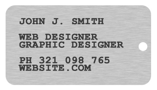
Silver and Gold – A Premium Business Card For Someone Who's Clearly Important

This is a full-colour business card, so it will be a bit more expensive to print than a business card printed with less colours.

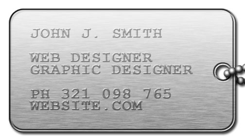
1 – Creating Metallic Text, and Adding a Wooden Finish the Very Easy Way

Double-click your background Layer, and press OK. This will make it into a regular layer. Right-click it, and choose Blending Options. Give it a:

Bevel (Style: Inner Bevel, Technique: Chisel Hard, Depth: 72%, Size: 12, Soften: 4. Leave all other options as default.)
Texture (Pattern: Kraft Waffle [Click the sideways triangle if you can't see it. It's in Color Paper, and its small icon looks brown], Scale: 400%, Depth +12%.)
Gradient Overlay (Click the little picture of a gradient. Gradient Type: Noise, Roughness: 70%. Restrict Colors: Ticked. Move all the G and B sliders all the way to the left. Put the two R (red) sliders at about 10% and 20% of the way along the bar. Keep clicking Randomize until you get a nice wooden look.)

Use the Type Tool to type in your name, and again to type in all your details. I've used Palatino Linotype font here, and the colours (FFD145) for gold, and (C1CCD1) for silver.

Right-click one of your text layers, and set some Blending Options:

Drop Shadow (Distance: 20, Size: 20.)
Bevel (Style: Inner Bevel, Technique: Chisel Hard, Size: 116, Soften: 4, Gloss Contour: Ring, Anti-Aliased: Ticked.)

Right-click the layer, and click Copy Layer Style. Then right-click on your other text layer, and click Paste Layer Style.

Click File > Open, and open your photo.

Select the desired area, then click Image > Crop.

Use the Move Tool to drag it into your main window.

Right-click your photo's layer, in the Layers window, and change its Blending Options.

Bevel (Style: Outer Bevel, Technique: Chisel Hard, Direction: Down, Size: 8, Gloss Contour: Ring-Double.)

"Moonbase" Website Layout – Page 2 of 2

"Moonbase" Website Layout – Page 2 of 2

The last half of this tutorial goes into adding the nice lighting effects, and putting on the finishing touches.

5 – Using channels to design web buttons

Create a new channel. (Click Window > Channels, if you can't see the Channels window.) The screen should go black.

Fill the selected area with white. (The shortcut to do this is Alt+Backspace.)

Press Ctrl+D to deselect.

Click Filter > Blur > Gaussian Blur. Set the Radius to 6 pixels.

Click Image > Adjustments > Levels (or press Ctrl+L). Move the black and white sliders almost to the centre of the histogram. You want your white areas to become rounded and smooth, but not blurry or jagged.

In the Channels window, Ctrl+Click on the new channel you've created. (You need to Ctrl+Click on the little thumbnail.)

Go back to the Layers window, and create a new layer, directly above your brown Shape Layer.

Fill the selected area with a dark grey. (I've used 575757 here.)

In the Layers window, change this layer's mode from Normal to Difference.

Choose the Move Tool, and nudge the buttons to the left a bit, with the Left Arrow key. You can move the layer around to a better spot if it doesn't look quite right.

Right-click the layer, and click Create Clipping Mask.


6 – Adding cloudy light to the website menu

Create a new layer, directly above the layer with your blue buttons in it.

Right-click this layer, and click Create Clipping Mask.

Press D to reset your colours to black and white.

Click Filter > Render > Clouds.

Click Image > Adjustments > Brightness/Contrast. Increase the Contrast to 24.

Change this layer's Mode to Hard Light, and its Opacity to 70%.


7 – Adjustment Layers

With any design, it's always a good idea to play around with the colours at the end. A website design can usually be improved with a bit of colour alteration.

Above your existing layers, create a new Brightness/Contrast Adjustment Layer. Set the Brightness to 12, and the Contrast to 32.

Create a new Vibrance Adjustment Layer. Set the Vibrance to 60, and the Saturation to 10. (Vibrance is a new Adjustment Layer in Photoshop CS4. It increases colour saturation on less-saturated areas more, which stops the more-saturated areas of your image from becoming over-saturated. If you're using an earlier version of Adobe Photoshop, then just alter the Brightness/Contrast settings a bit more.)


8 – Adding text to your web page header and menu buttons

I've used Beals Cocktail Font for the text on this layout. Century Gothic is an acceptable alternative here.

Use the Type Tool to type in your header text. I've set the colour to black, and the font size to 40pt (except for the first letter, which is 50pt.)

Right-click this layer, and click Blending Options.

Outer Glow (Set the colour to white.)
Bevel (Style: Inner Bevel, Technique: Chisel Hard.)
Texture (Pattern: Beige with White Flecks.)

Use the Type Tool to type in your sub-header. I've set the colour to blue (#005D9B), and the font size to 20pt (except for the first letter of each word, which is 50pt.) Right-click your header text layer, and click Copy Layer Style. Right click your sub-header text layer, and click Paste Layer Style.

Type in some white text on your first button. (Font size 20pt, with 27pt for first letter.) Press Enter, then type in the text for the next button. Do this until you've typed in all your button text.

In the Character window (Window > Character, if you can't see it), change the Leading (the "A" on top of another "A") to around 50, so that each of the lines of text lines up with a button.

Right-click this layer, click Blending Options.

Bevel (Style: Inner Bevel, Technique: Smooth, Size: 1.)

That's it. All you need to do now is to use the Slice Tool, to cut the image into a tall menu, and a wide header.

Click File > Save for Web and Devices, choose Jpeg, Quality: 60, and click Save.

In your web editor, you'll need to use a Hotspot or Image Map (depending on your web page editor), to make each of the buttons into a link.

"Moonbase" Website Layout – Page 1 of 2

"Moonbase" Website Layout – Page 1 of 2

This tutorial shows how to make a starkly lit sandy website template, with a menu of blue buttons. This tutorial was created in Photoshop CS4.

1 – Creating the structure of the page

Click File > New. Enter a Width of around 700, and a Height of around 500. Press OK.

Set your foreground colour to brown. (I've used 5A2A00 here.)

Select the Pen Tool. Make sure the little Shape Layers icon at the top left of the screen is clicked. Click the Pen Tool to draw a triangle, as shown. (Remember to finish on the same point you started on, to complete the loop.) You may need to maximise the window for this step, so you can see the points properly.


2 – Warping the path

Ctrl+Click on the path, so that you can see the existing points, and then click on the path a few times, to add a few new points. (If you lose the selection of your path, you can always retrieve it from the Paths window. Click Window > Paths.) You can drag the points around, select them, or drag their "arms" around, by holding Ctrl while you do so.


3 – Blending Options

Right-click this layer in the Layers window, and click Blending Options.

Drop Shadow
Bevel
(Style: Inner Bevel)
Texture (Pattern: Beige with White Flecks [Click the sideways triangle if you can't see it. It's the second texture in Color Paper].)
Gradient Overlay (Blend Mode: Overlay. Opacity: 70%. Style: Radial. Scale: 150%. Click the little picture of a gradient. Add "Color Stops" [the little tab shapes] along the bottom of the gradient. Put black Color Stops at 0%, 33%, 67%, and 100%. Put white stops half-way between them, at 17%, 50%, and 83%. You can drag the gradient around on your image, while you're doing this. Drag it so that its centre is towards the top left of your image, as shown. You may need to come back in here later, to drag the gradient around some more.)

Choose the Move Tool. Press Shift+Up Arrow, then Shift+Left Arrow. This will move the brown area off the image a bit, so that the left and top bevels, and the "ends" of the Drop Shadow, aren't visible. (Holding Shift, while pressing the arrow key, causes the object to be "nudged" by ten pixels at a time, instead of one.)


4 – Selecting the shapes of menu buttons

Click View > Show > Grid (or just press Ctrl+').

Click View > Snap (or just press Shift+Ctrl+;).

Click View > Snap To > Grid (if it's not already ticked.)

Select four rectangular areas, as shown. Hold Shift each time you make a new rectangle, so that the previous selection doesn't disappear. When you select these rectangles, they'll extend into the white area.

Alt+Shift+Ctrl+Click on your brown Shape Layer, in the Layers window. This will trim the ends of the rectangles off.

Making a Circuit Board Website Layout in Photoshop – Page 4 of 4

Making a Circuit Board Website Layout in Photoshop – Page 4 of 4

This page of the tutorial shows how to put the pieces together, and slice the image for placement into a website.

8 – Putting everything together, and adding tracks

Hold down Alt, while using the Move Tool, to make more copies of the "hole" you created earlier. (You might also want to put them all into a new Layer Set.) Use the grid to arrange the holes, and make appropriate places for your components to go.

Resize your integrated circuit, by clicking on its layer set, in the Layers window, and pressing Ctrl+T. (Remember to hold Shift while doing so.) Repeat this process for your resistor.

Right-click your resistor layer set, and duplicate it. You can edit the colours of the bands on the new one if you like. (If you rotate it, you'll need to go into the Blending Options, and change the angle of the Gradient Overlay too. The Gradient Overlay won't automatically rotate when the layer is rotated.)

Drag the various pieces into place.

Create a new layer.

With the grid and snapping turned on, use the Line Tool to draw a network of tracks on your website design. (I used colour #A8A8A8 here.)

Add some Blending Options to this layer.

Drop Shadow (Blend Mode: Normal. Opacity: 100%. Distance: 1px. Size: 1px.)
Stroke (Size: 1px. Color: #B2B2B2.)


9 – Slicing up the web page layout

Use the Slice Tool to slice the image up as shown. The little slices at the top right and bottom left should be one pixel wide. I've made them wider here, just so that you can see them. You may need to zoom right in for this.

Click File > Save for Web and Devices. This will now save each slice as a separate image.

In your web page editor, make a table with one cell, and a width of 100%. Put the header image (01) into it, and set the one-pixel-wide "sliver" image as its background.

Underneath that table, make another table, but with two cells, next to each other. In the left cell, put in image 03, and set the sliver (05) as the cell's background.